Dashboard chart: Assets by team
This chart analyzes the number of assets (repositories, images) managed by each team in the system.
Note: Charts use data from the most recent successful scan. Click Refresh to reload data.
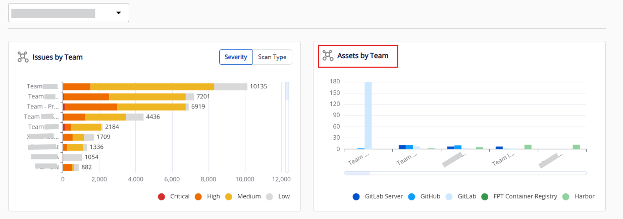
Chart structure
| Component | Description |
|---|---|
| Chart type | Grouped bar chart |
| X axis | Team/sub-team names (sorted left to right by total assets, descending) |
| Y axis | Number of assets per integration tool |
| Legend | List of integration tools, displayed bottom right |
| Group column | Each team has one group of up to 5 sub-columns — each sub-column represents one integration tool |
Filtering data
Use the legend options (bottom right):
- Click to show/hide data by asset type, including assets from GitHub, GitLab, GitLab Server, FPT Container Registry, and Harbor.
You can also apply a team filter at the top of the dashboard to narrow data to a specific department.